The Academy
Project Overview
At Paymentsense, we were tasked with rebranding their employee training system, known as The Academy. The goal was to create a design that conveyed an academic look and feel while aligning seamlessly with the existing Paymentsense brand identity.
My Role
I led the design process focused on:
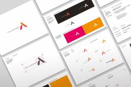
Developing a simple, clean visual identity that embodies the concept of learning and growth within the company
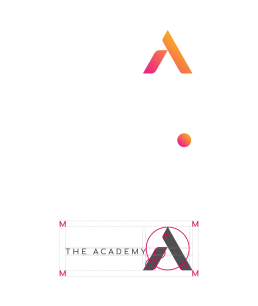
Creating a strong mark/logo that visually represents the idea of ‘building’ employee knowledge and understanding
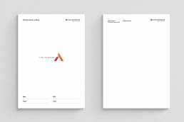
Designing easy-to-use tools for both print and digital learning platforms
The Challenge
The design needed to reflect the academic nature of the training system while remaining consistent with Paymentsense’s existing branding
As a Fintech company, clarity and simplicity were essential to help employees navigate the learning materials efficiently
The tools had to be intuitive for users at different stages of their career journey, supporting their development over time
Creative Approach
I began by exploring what academia represents—structure, growth, and knowledge-building—and translated these ideas into a strong, simple mark that symbolizes employee growth within the business.
The Paymentsense colour palette and typography were used throughout to ensure consistency and brand alignment.
To maintain simplicity, the learning tools were designed to be typographically driven, with clean layouts supported by icon markers to assist navigation within workbooks.
The e-learning platform featured straightforward instructions and minimal distractions to make the learning experience smooth and accessible.
Outcome
The rebrand successfully delivered a clean, cohesive identity for The Academy that felt both academic and approachable. The simple, clear design enhanced usability across print and digital platforms, helping employees easily engage with training materials and supporting their growth within Paymentsense.
Reflection
This project underscored the value of simplicity and strategic alignment in educational design—creating tools that not only look professional but also genuinely support user learning and development.
ClientPaymentsenseServicesDesign DirectorLinkwww.designrush.com


