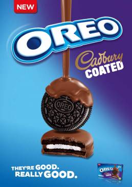
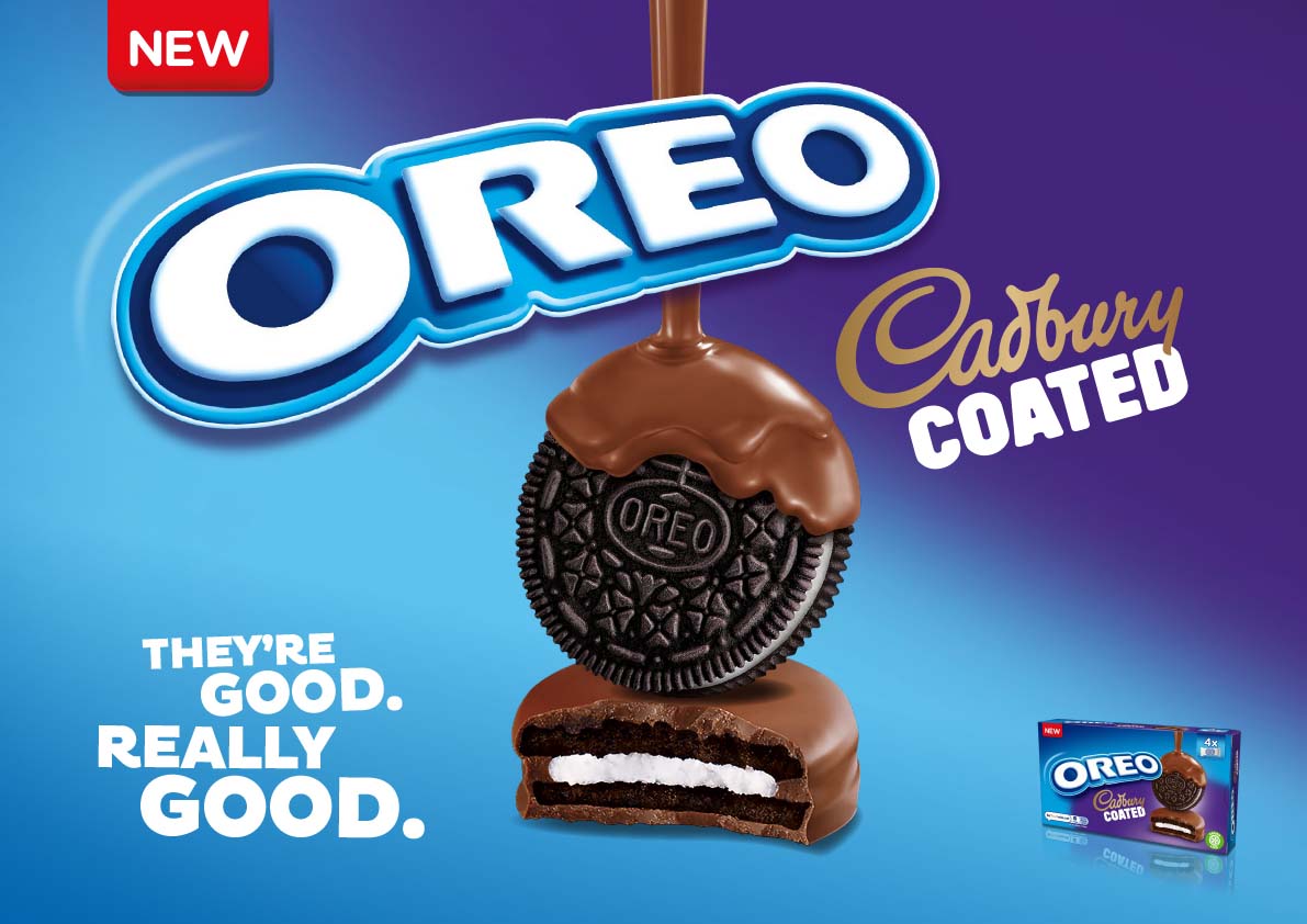
To support the launch of the new Oreo x Cadbury cookie, I was tasked with designing an in-store promotional visual using existing brand assets and fonts. The creative challenge centered on balancing two iconic identities—Oreo and Cadbury—within a single, cohesive layout.
⸻
Design Challenge
The main focus was creating a centre-aligned composition that navigated the complex visual hierarchy between the two brands:
• Cadbury had to retain its signature purple background, anchoring its recognizability.
• Oreo, however, required a dominant presence of blue, as this is core to its brand equity.
This meant carefully managing colour distribution and layout to ensure both brands were equally represented without overpowering each other.
⸻
Typography Approach
Another key departure was the typographic treatment. Oreo typically uses left-aligned, stacked copy, but for this collaboration, we introduced a centre-aligned, more playful typographic style. This decision brought freshness to the presentation and aligned with the fun, unexpected nature of the product—a fusion of two beloved treats.
⸻
Outcome
The final in-store design struck the right balance between the two brands, creating a visually engaging and playful composition that celebrated their collaboration. It remained faithful to brand guidelines while pushing creative boundaries just enough to spark curiosity and stand out in a retail environment.