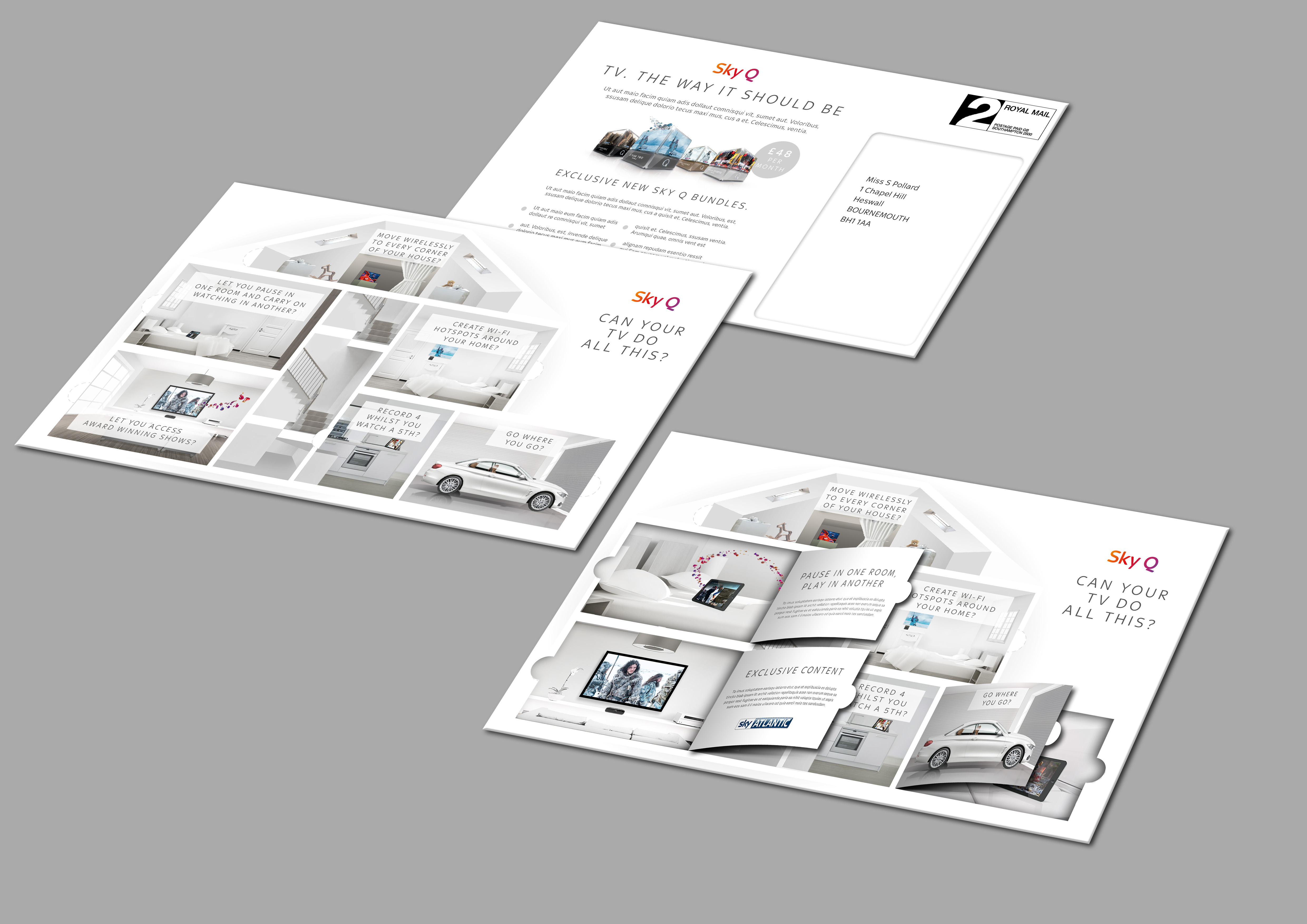
Project Overview
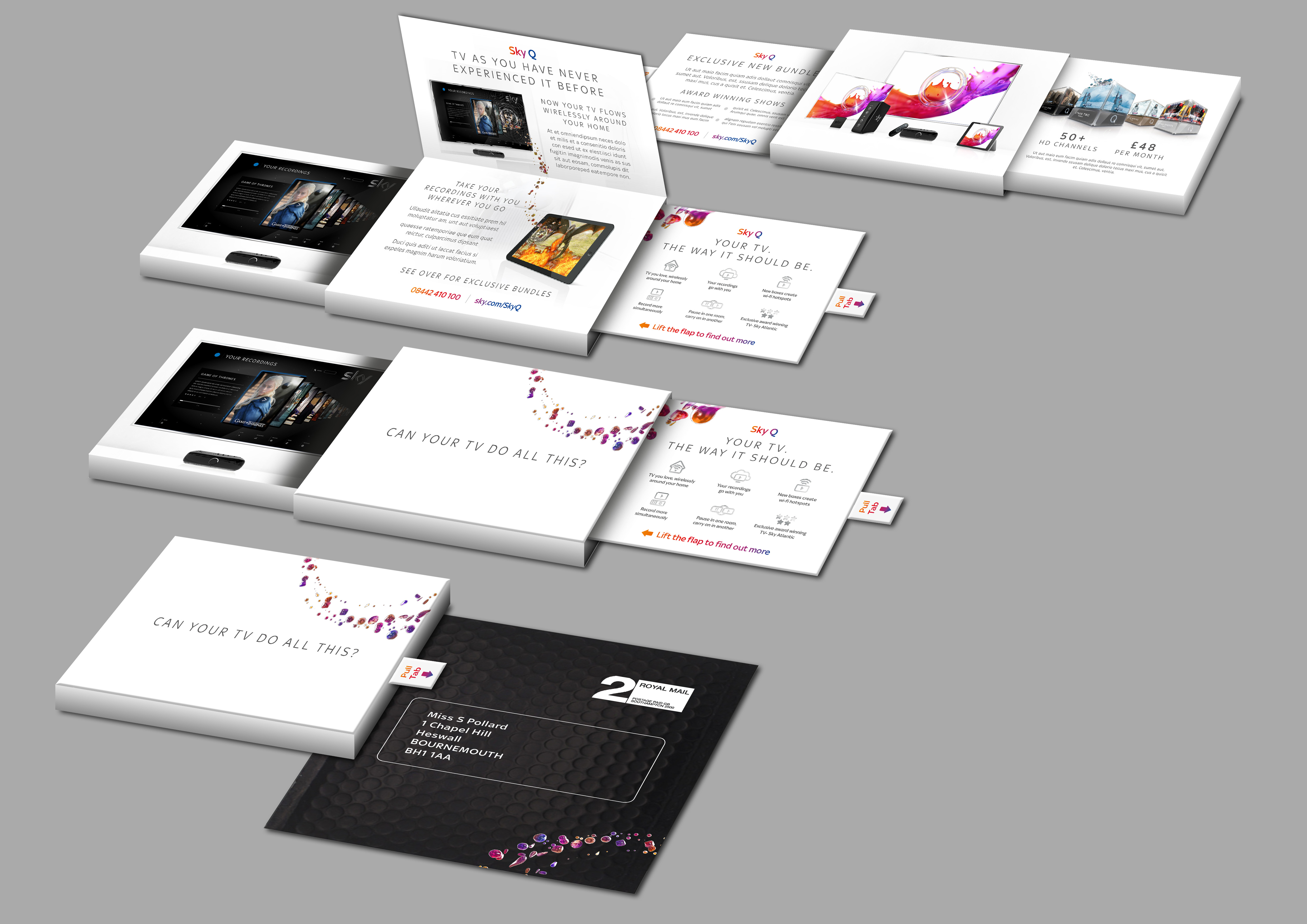
For the launch of Sky Q, Art Director Natasha Blevins and I were tasked with translating the concept of “Fluid Viewing” into an immersive and visually striking campaign. Our focus was on creating compelling creative assets for online videos, Direct Marketing, and email campaigns that conveyed the seamless entertainment experience Sky Q promised.
My Role
As the Designer working alongside Natasha, I contributed to:
Designing and developing creative concepts and assets tailored for digital channels and direct communication
Helping evolve Sky’s visual identity through typography and graphical innovation
Collaborating closely to ensure consistency and impact across all campaign touchpoints
The Challenge
Sky’s existing bold SKY font felt heavy and didn’t reflect the modern, fluid experience Sky Q aimed to deliver
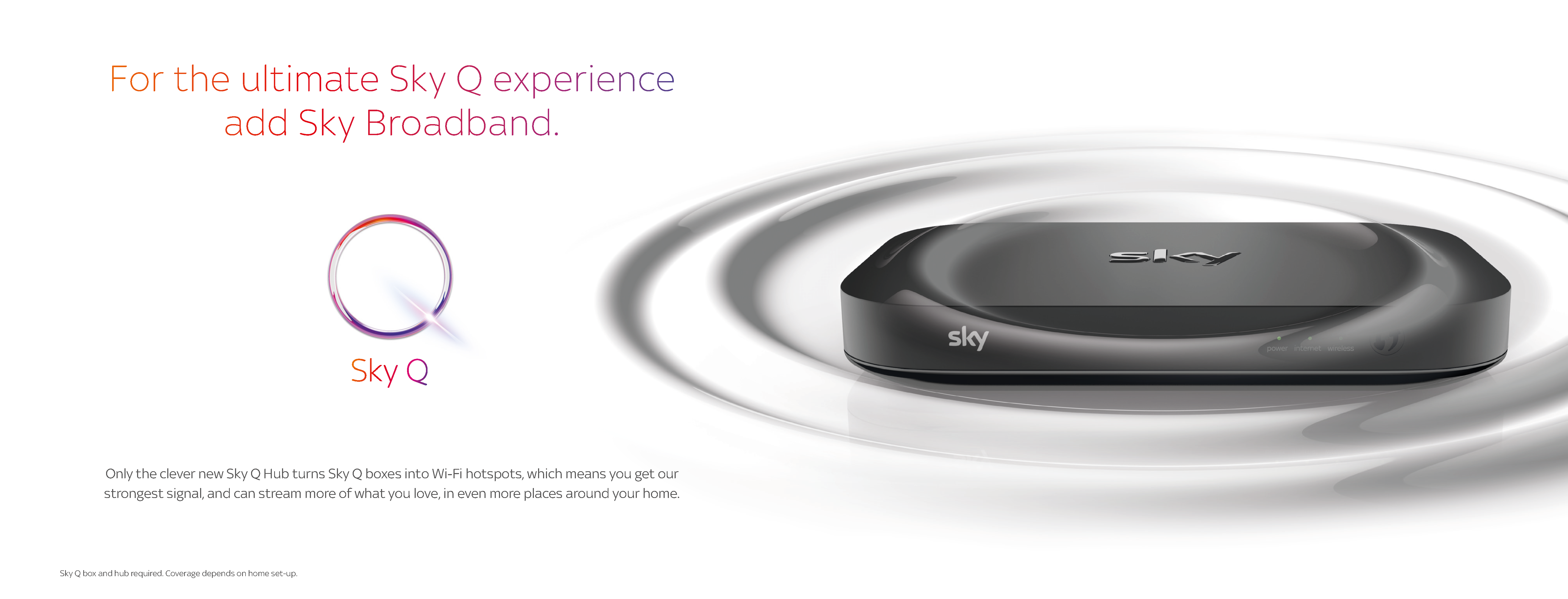
Sky’s main competitor, BT, used solid vector graphics to represent their WiFi branding, so Sky needed a distinct visual language for their router and network
We needed to create visuals that worked effectively in digital video, DM, and email formats while maintaining brand cohesion
Creative Approach & Solutions
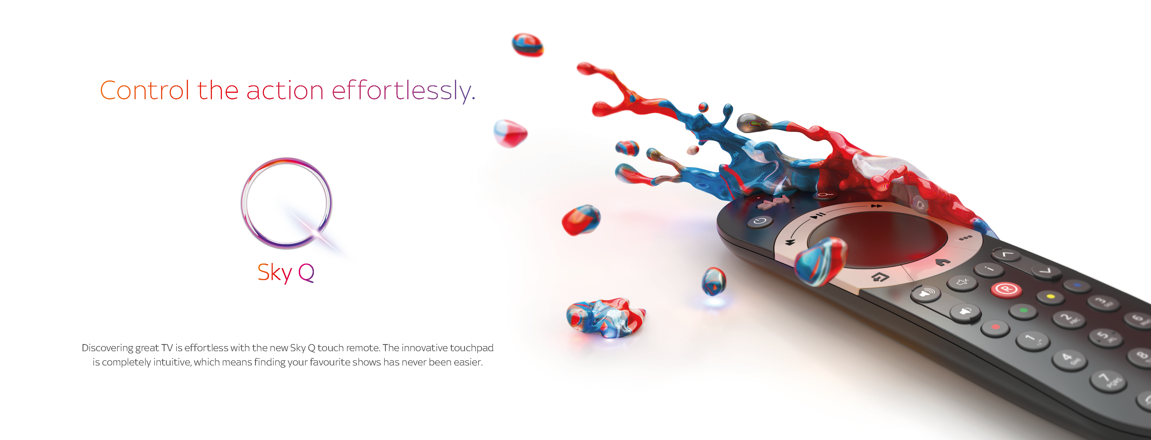
Redesigning the SKY Font: We influenced Sky to create a new light version of their SKY font, which brought a cleaner, more contemporary look to the brand and aligned with the campaign’s fresh, fluid messaging.
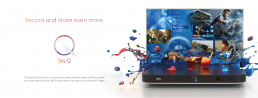
The Ripple Concept: To visually communicate the flow of information across devices and rooms, we developed the “ripple” graphic motif—an organic, flowing pattern symbolizing connectivity throughout the home. This approach differentiated Sky’s WiFi presence from competitors and reinforced the campaign narrative of seamless viewing.
Outcome
Our work helped Sky present a modernized, immersive visual identity for the Sky Q launch. The ripple concept and new typography were key visual elements that strengthened the brand’s position and resonated across digital and direct marketing channels.
Reflection
This project highlighted the power of thoughtful collaboration and strategic design evolution. Working with Natasha, we turned a complex technology concept into a beautiful and accessible visual language that helped Sky Q stand out in a competitive market.